
Microsoft Excel is extremely powerful and widely used in industry when working with complicated data sets. It isn’t, however, a designer’s best friend as its compatibility with design software commonly leads to much frustration. As designers, we want to take the content from Excel and manipulate it to ensure that it can be seamlessly integrated into our artworks to deliver publications that audiences can engage with effectively.
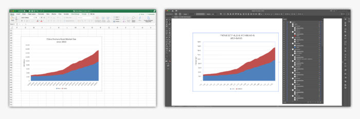
The issues we face are that we often need to alter elements (colours, fonts and layout, etc) of graphs that have been created in excel but experience is taught us that this can commonly be an uphill struggle and we’ve found that we’ve achieved the best results by recreating client graphs ourselves using their data directly within the Adobe Illustrator workspace.
This gives us absolute control over the different elements that combine to make a data visualisation (the title, axis, legend, etc). It also means that if a change is made to the data of a graph in the proofing stage, it can be updated dynamically rather than needing to be re-traced or placed afresh.

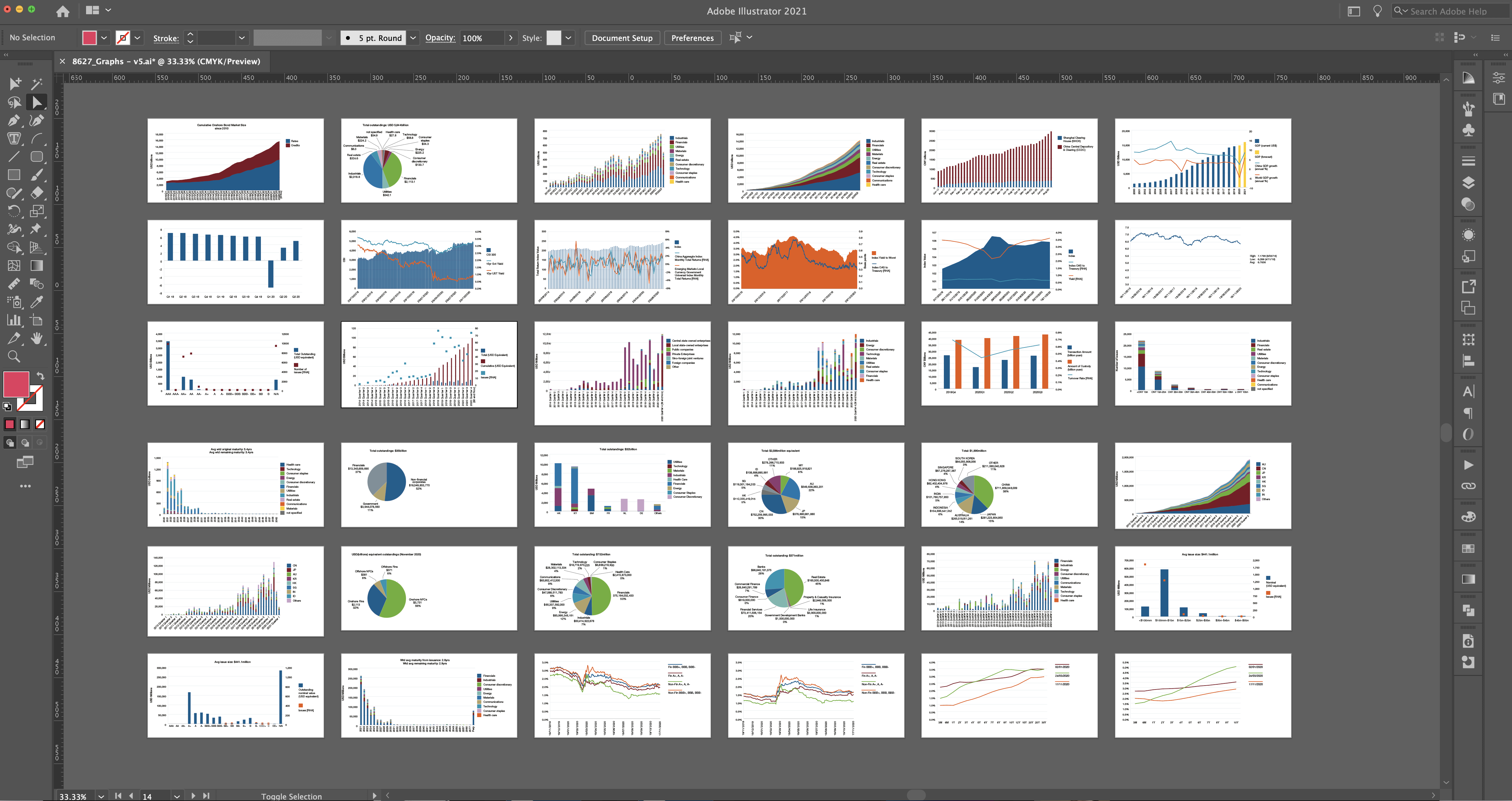
The reports, briefing notes and other documentation that we’ve undertaken for ICMA (International Capital Market Association) has given us ample opportunity to master a range of different graph styles. Graphs can vary in complexity from simple pie charts to graphs that combine bar and line graph styles with split axis. Knowing how to work with these graph styles in Illustrator requires a deeper understanding of certain software aspects but has proved exceptionally rewarding when the final execution is complete.