

Challenge
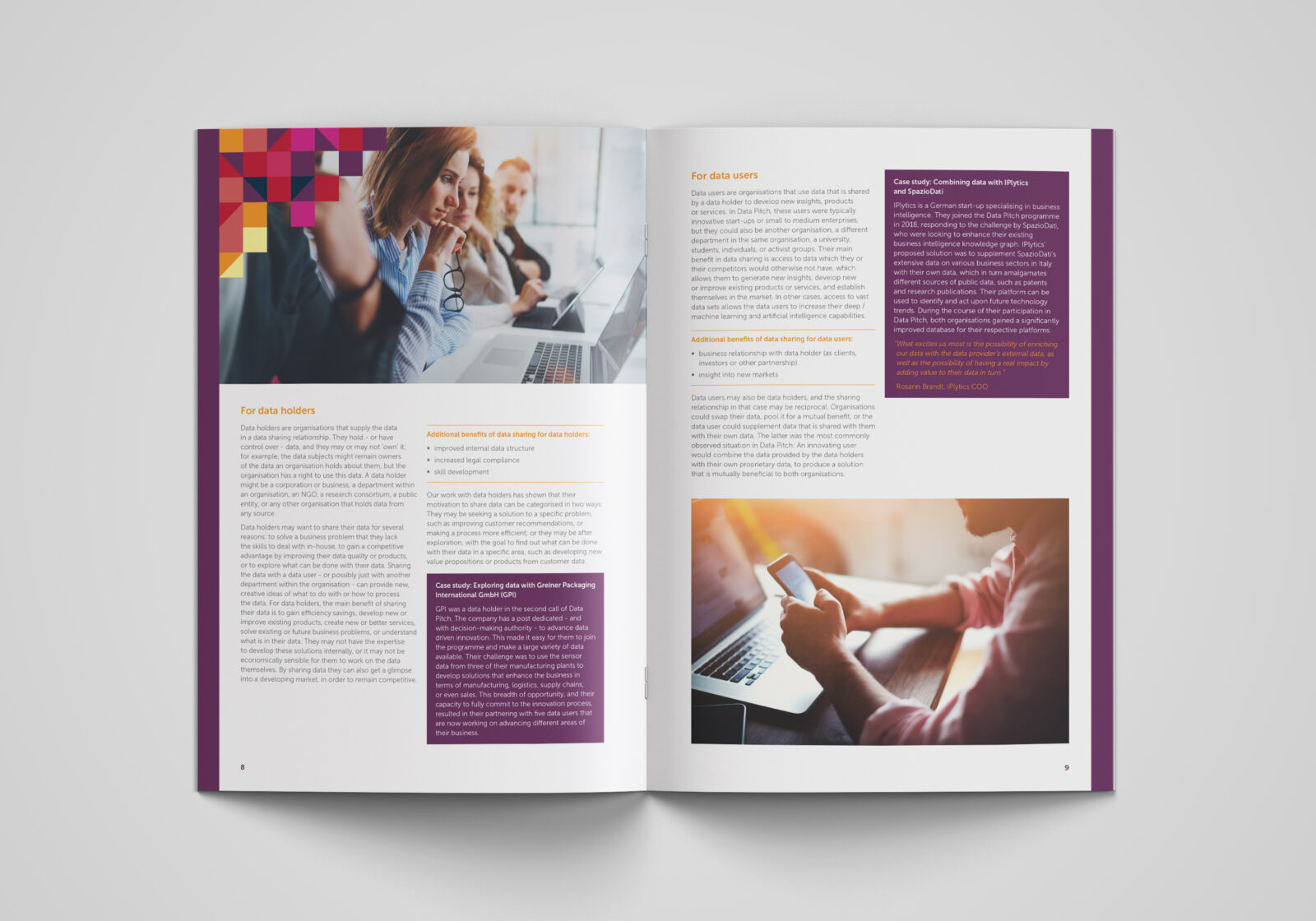
The initial requirement was to create a toolkit on the subject of data sharing. The toolkit aims to give background to the process of data sharing, provide examples of how suggested concepts can be applied and then provide a framework that readers can follow to suit their own data sharing needs.
Process
Naturally, it’s essential for a toolkit of this nature to be easy to use. Areas of focus to ensure that was achieved included establishing a strong content hierarchy, colour coding sections clearly for easy navigation within the toolkit as well as sourcing appropriate imagery to enhance audience engagement.
With the Data Pitch identity already in place, we had to carefully follow their visual guidelines to ensure the toolkit fitted seamlessly with other deliverables.
Outcome
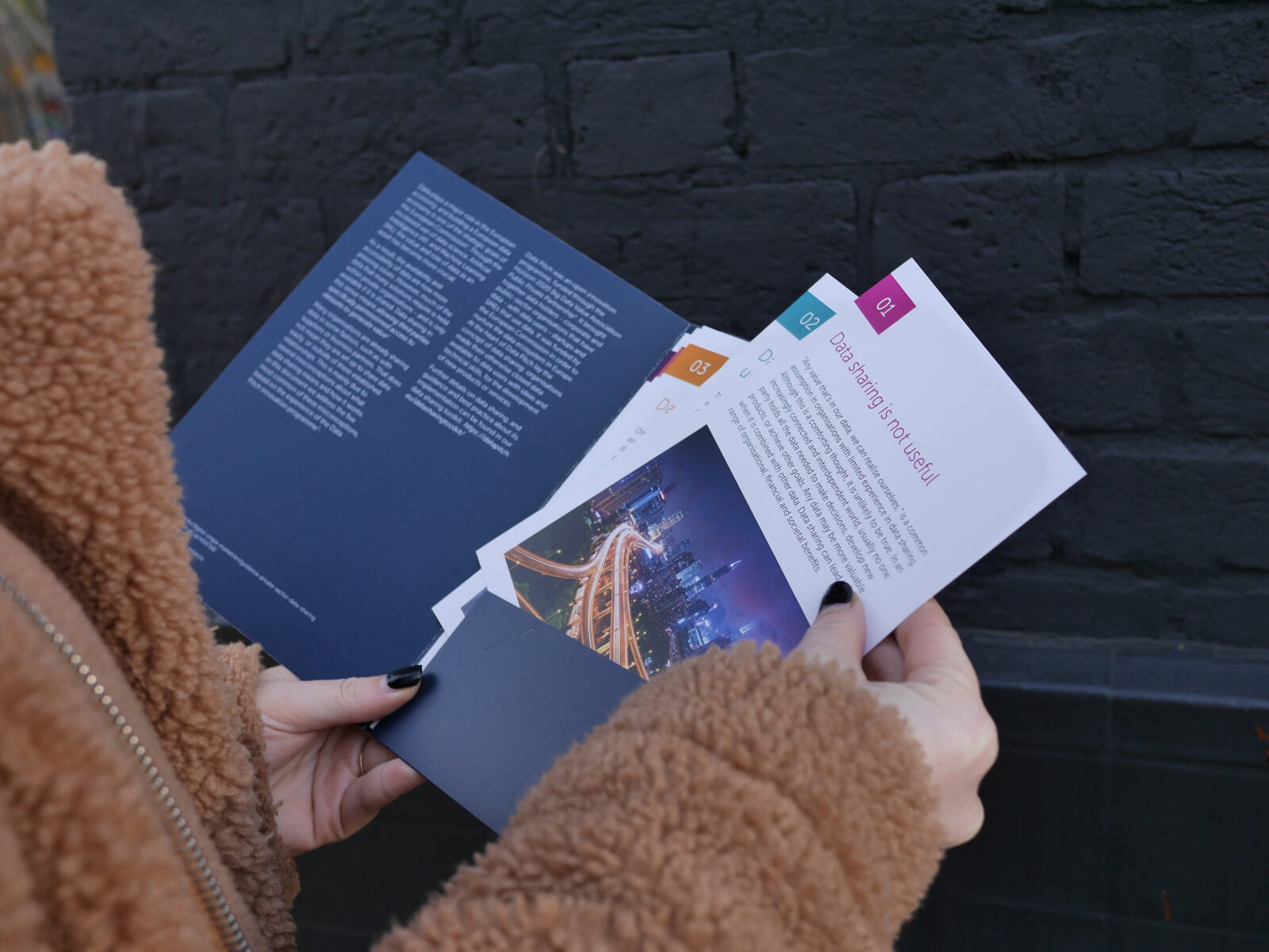
Following the successful delivery of the Data Sharing Toolkit, we were subsequently commissioned to undertake two further projects: Integrating the toolkit into the Data Pitch website; and creating a Data Sharing Mythbuster. For the Mythbuster, the client was looking for a different way of communicating their ‘5 myths about data sharing’ so we proposed a number of potential executions. The chosen idea involved creating a capacity folder into which 5 inserts were placed, each detailing one of the data sharing myths. We used a different accent colour from the Data Pitch identity on each of the inserts which created a vibrant contrast against the deep blue of the folder, making an engaging communication piece.
Questions to the client
What was your favourite design feature in the work?
We loved the design of our client event retractor banner, and the accompanying brand sub-identity Fever helped us create for our events! It remained consistent with our main brand, utilising elements of that more corporate design, while also taking a more creative direction to make something entirely separate and eye catching.
What 3 words would you use to summarise working with us?
Innovative
Efficient
Collaborative
Did anything stand out in our approach / methodology?
Fever always go above and beyond, even utilising such details as hand-drawn illustrations if the occasion calls for it. They are always very understanding of strict deadlines and prioritise their work accordingly, and gladly take on board any suggestions we may have.