

The name Hatch would suggest an enterprise unit which empowers and where ideas are not only born, but their consequent impact are innovative.
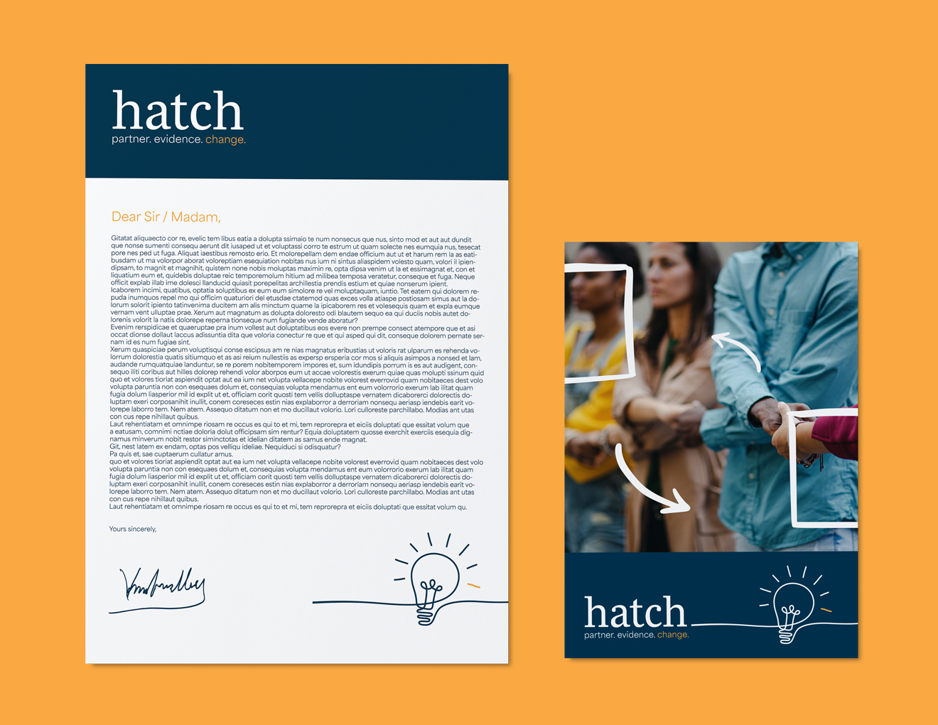
The process of creating an identity began conceptually, taking the enterprise name and developing a characterful visual which would communicate innovation and community. The simple one-line drawing not only suggests innovation, but also a sense of continuity and collaboration with the clients with which the enterprise works. The less angular choice of line adds a touch of character to reinforce the messaging of Hatch as an additionally creative and authentic enterprise.
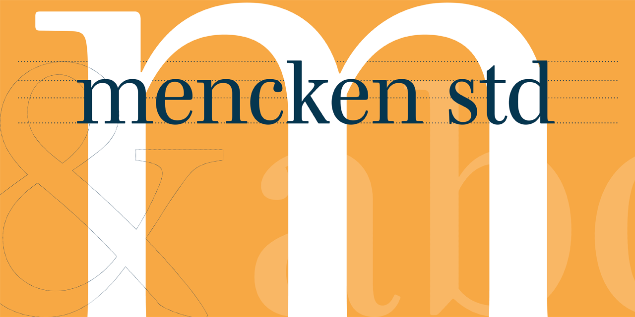
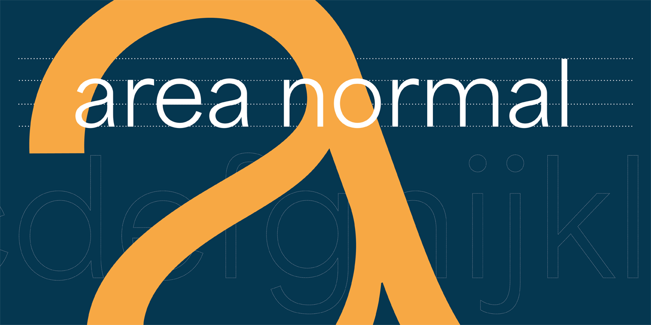
As Hatch distinguishes itself from market competitors as an enterprise which employs academic rigour, a serif font is used as a headline to allow for a sense of formality, accountability and confidence for the target audience. The logo is set in lower case to additionally represent the mission of hatch’s work — the empowerment of social change workers — acts of collaboration and non-hierarchical work. Furthermore, a sans serif is used for the strapline, to ensure clear messaging to target audiences throughout their communications.
The primary colour palette of a deep navy and yellow was explored to evoke trust, establishment and positivity, in relation to the Hatch mission of inspiring confidence and evaluating work based on sound evidence. A somewhat limited palette can hold more presence, accountability and consistency for the enterprise whilst still maintaining room for visual growth as the brand evolves.
Additionally, the secondary palette was created to allow the enterprise identity to have the flexibility and confidence to visually marry hatch with the palette of the University of Southampton, where necessary.
The pull-out devices were created in-line with the primary visual — the hatch lightbulb — based on the logo strapline and enterprise pillars: partner, evidence, change. The boxes, arrows and circles are used to further communicate a sense of “thinking outside the box;” circles suggesting community and circularity, with arrows signposting the eye to innovation. These shapes were created to reinforce the importance of the enterprise values and to be used thematically, depending on the content and messaging presented. Visually, each pillar is relatively simple and open, to encompass a broad range of directions possible to hatch in the beginning stages of the enterprise.